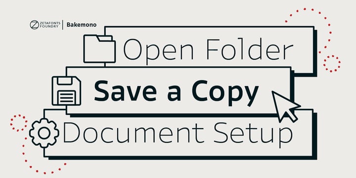
Francesco Canovaro created Bakemono as a way to explore the design space around the duality of fixed/proportional width. He was also interested in the concept of monowidth design, inherent in monospaced typefaces, that can bring flexibility and ease of use also to proportional type - allowing you to change the weight of a word without losing the text alignment. In his research on fixed width type design he mixed the lessons of mechanical typewriter technology with the intuitions of eastern brush calligraphy, which has been dealing with for centuries with fixed space grids.
The name of the typeface comes from the Japanese shape-shifter yokais that could change their form freely between human and animal, and aptly describes the metamorphic nature of this wide superfamily coming in proportional, monospace and intermediate subfamilies. With a design mixing the expansion principles of the brush with the sharp technicality of typewriter and system fonts, Bakemono can both excel at text size in its regular widths optimized for legibility as well as owning the page at display size with its uncommon design details.
Bakemono reflects its multicultural nature with its extended latin + cyrillic charset, soon to be expanded with Bakemono Arabic (exploring the fascinating world of monospaced arabic script) and Bakemono Kana (our first experiment in cjk scripts).
• Suggested uses: born to allow you to change the weight of a word without losing the text alignment, Bakemono can both excel at text size in its regular widths optimised for legibility as well as owning the page at display size with its uncommon design details. Perfect for contemporary branding, web design, packaging and countless other projects;
• 21 styles: 7 weights x 3 different styles + 1 variable font;
• 839 glyphs in each weight;
• Useful OpenType features: Access All Alternates, Contextual Alternates, Case-Sensitive Forms, Glyph Composition / Decomposition, Denominators, Fractions, Localized Forms, Mark Positioning, Mark to Mark Positioning, Alternate Annotation Forms, Numerators, Ordinals, Scientific Inferiors, 7 Stylistic Sets, Subscript, Superscript, Slashed Zero
• 217 languages supported (extended Latin and Cyrillic alphabets): English, Spanish, Portuguese, French, Russian, German, Javanese (Latin), Vietnamese, Turkish, Italian, Polish, Afaan Oromo, Azeri, Tagalog, Sundanese (Latin), Filipino, Moldovan, Romanian, Indonesian, Dutch, Cebuano, Igbo, Malay, Uzbek (Latin), Kurdish (Latin), Swahili, Hungarian, Czech, Haitian Creole, Hiligaynon, Afrikaans, Somali, Zulu, Serbian, Swedish, Bulgarian, Shona, Quechua, Albanian, Catalan, Chichewa, Ilocano, Kikongo, Kinyarwanda, Neapolitan, Xhosa, Tshiluba, Slovak, Danish, Gikuyu, Finnish, Norwegian, Sicilian, Sotho (Southern), Kirundi, Tswana, Sotho (Northern), Belarusian (Latin), Turkmen (Latin), Bemba, Lombard, Lithuanian, Tsonga, Wolof, Jamaican, Dholuo, Galician, Ganda, Low Saxon, Waray-Waray, Makhuwa, Bikol, Kapampangan (Latin), Aymara, Ndebele, Slovenian, Tumbuka, Venetian, Genoese, Piedmontese, Swazi, Zazaki, Latvian, Nahuatl, Silesian, Bashkir (Latin), Sardinian, Estonian, Afar, Cape Verdean Creole, Maasai, Occitan, Tetum, Oshiwambo, Basque, Welsh, Chavacano, Dawan, Montenegrin, Walloon, Asturian, Kaqchikel, Ossetian (Latin), Zapotec, Frisian, Guadeloupean Creole, Q’eqchi’, Karakalpak (Latin), Crimean Tatar (Latin), Sango, Luxembourgish, Samoan, Maltese, Tzotzil, Fijian, Friulian, Icelandic, Sranan, Wayuu, Papiamento, Aromanian, Corsican, Breton, Amis, Gagauz (Latin), Māori, Tok Pisin, Tongan, Alsatian, Atayal, Kiribati, Seychellois Creole, Võro, Tahitian, Scottish Gaelic, Chamorro, Greenlandic (Kalaallisut), Kashubian, Faroese, Rarotongan, Sorbian (Upper Sorbian), Karelian (Latin), Romansh, Chickasaw, Arvanitic (Latin), Nagamese Creole, Saramaccan, Ladin, Kaingang, Palauan, Sami (Northern Sami), Sorbian (Lower Sorbian), Drehu, Wallisian, Aragonese, Mirandese, Tuvaluan, Xavante, Zuni, Montagnais, Hawaiian, Marquesan, Niuean, Yapese, Vepsian, Bislama, Hopi, Megleno-Romanian, Creek, Aranese, Rotokas, Tokelauan, Mohawk, Onĕipŏt, Warlpiri, Cimbrian, Sami (Lule Sami), Jèrriais, Arrernte, Murrinh-Patha, Kala Lagaw Ya, Cofán, Gwich’in, Seri, Sami (Southern Sami), Istro-Romanian, Wik-Mungkan, Anuta, Cornish, Sami (Inari Sami), Yindjibarndi, Noongar, Hotcąk (Latin), Meriam Mir, Manx, Shawnee, Gooniyandi, Ido, Wiradjuri, Hän, Ngiyambaa, Delaware, Potawatomi, Abenaki, Esperanto, Folkspraak, Interglossa, Interlingua, Latin, Latino sine Flexione, Lojban, Novial, Occidental, Old Icelandic, Old Norse, Slovio (Latin), Volapük

![[hnvmp] Download Privilege Sign JNL fonts from Jeff Levine](https://cdn.myfonts.net/cdn-cgi/image/width=720,height=360,fit=contain,format=auto/images/pim/10000/cYp4Ld5sIQVDMwhMXG2psOXJ_03308038c4fd7aaa80aeafcd2cdadfa1.png)
![[odecx] Download Nouveau Meadow JNL fonts from Jeff Levine](https://cdn.myfonts.net/cdn-cgi/image/width=720,height=360,fit=contain,format=auto/images/pim/10000/U0SAYIKO9DZ7CT813iplbkqe_d2a568a0139b9cb6398c21e94662db6b.png)
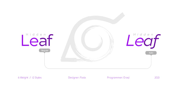
![[kuxmy] Download Foda Egypt fonts from Fo Da](https://cdn.myfonts.net/cdn-cgi/image/width=720,height=360,fit=contain,format=auto/images/pim/10000/6jYlcMTqSYbNmfoG4tQfyg9z_31c30d2ca459f01a01cb1c96ebe6599a.png)
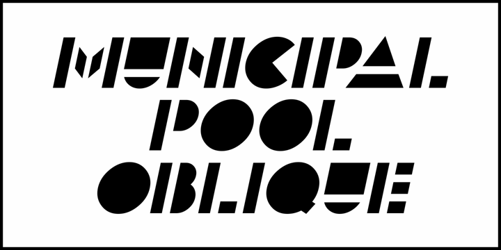
![[syokc] Download Municipal Pool JNL fonts from Jeff Levine](https://cdn.myfonts.net/cdn-cgi/image/width=720,height=360,fit=contain,format=auto/images/pim/10000/FxsxHCj54hTsJfyrmxLBvGuI_c37121731fedbae061af74b97e902755.png)
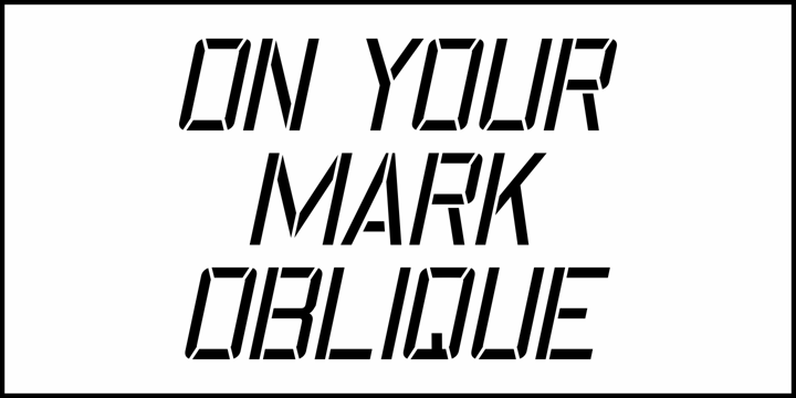
![[xrpkb] Download On Your Mark JNL fonts from Jeff Levine](https://cdn.myfonts.net/cdn-cgi/image/width=720,height=360,fit=contain,format=auto/images/pim/10000/NaIlSEDAS6nl0IhsikAgl9Tj_b80809769968812a09c3b697b4599a5b.png)
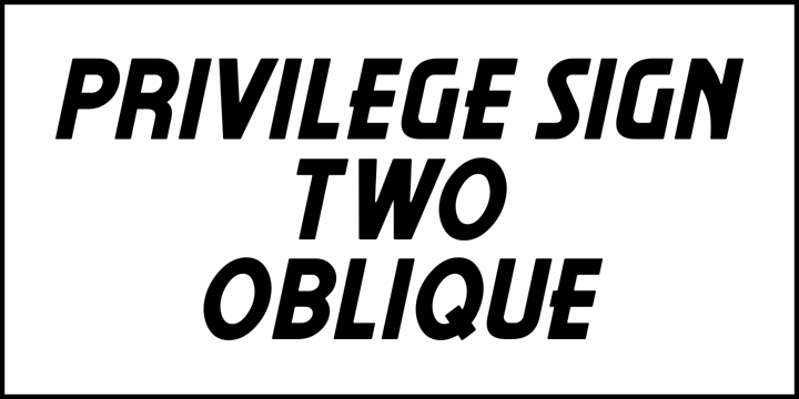
![[xwcgl] Download Privilege Sign Two JNL fonts from Jeff Levine](https://cdn.myfonts.net/cdn-cgi/image/width=720,height=360,fit=contain,format=auto/images/pim/10000/M6Yn6D5dbsd26nh64vsIL4XT_5c0fea16e588549ffc0f94184b5b959c.png)
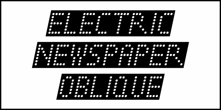
![[clshb] Download Electric Newspaper JNL fonts from Jeff Levine](https://cdn.myfonts.net/cdn-cgi/image/width=720,height=360,fit=contain,format=auto/images/pim/10000/jROoqBqveXisfcQXrZ74gjQA_082178dab277a5707042c7886f1cd493.png)
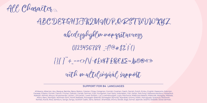
![[tabbu] Download Verathrine fonts from Nathatype](https://cdn.myfonts.net/cdn-cgi/image/width=720,height=360,fit=contain,format=auto/images/pim/10000/XQM3VoPeyYT4MyoQ95MhR0gb_0b487f175a7a79f6fac6e0ac3e670a4c.png)
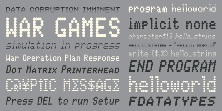
![[tjopq] Download Data Error AOE Pro fonts from Astigmatic](https://cdn.myfonts.net/cdn-cgi/image/width=720,height=360,fit=contain,format=auto/images/pim/10000/Mna2xI7YzzMLJFgn9KYFlVo3_14d9e3d018b4b0a2e106c469101b494a.png)
![[rhxsw] Download Bakemono fonts from Zetafonts](https://cdn.myfonts.net/cdn-cgi/image/width=720,height=360,fit=contain,format=auto/images/pim/10000/cGt42UpekORhLBUwqQ6GrZu9_64b3bb0c2588cb0da11045edc4226a66.png)